iLuvVivid Design Talk|Deciphering the “Emotional Code” Behind Colors
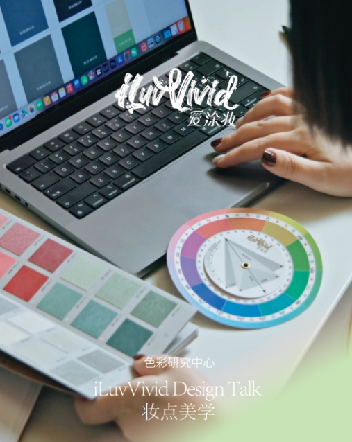
iLuvVivid Design Talk|Deciphering the “Emotional Code” Behind Colors
Artisan Paint · Imported Artisan Paint Brands · Top 10 Artisan Paint Brands · Luxury Artisan Paint · High Value Artisan Paint
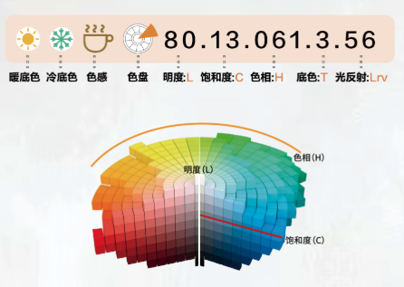
What is the Vivid code ?
In the previous content, we analyzed the LCH (physical coordinates) and T&LRV (application variables) of the “Vivid Code,” which provide a precise “digital ID” for colors.
iLuvVivid Design Talk
ISSUE 2
Technical data serves merely as a foundation. The true value of color lies in the emotional resonance it can evoke.
When a client’s desire for “a sense of happiness” or “a feeling of security” remains abstract, how can designers move beyond guesswork and accurately translate these needs into precise data?
(Video Content:
CARE Color Psychology is the core of the Vivid Code. Its key role is to scientifically link the psychological impact that colors have on viewers.
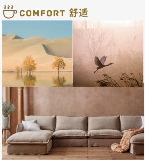
Comfort: Provides nourishing, peaceful, and healing colors. These are bright, relaxing hues that bring you a sense of happiness.
Authority: Projects a confident, professional, and commanding presence. These are deeper, more steady colors that make a space feel calm and secure.
Refinement: Offers luxurious, exquisite, and timeless elegance. These are typically colors with higher saturation, endowing a space with a noble and sophisticated feel.
Energy: Creates environments full of vitality and dynamism, inspiring passion. These are vivid and intense colors that bring energy and personality to a space.
Vivid Code transforms color from guesswork into precise application. Use it to identify, match, and drive your design.
*)
This is precisely the problem the core of “Vivid Code”—the C.A.R.E. Color Psychology System—aims to solve.
C.A.R.E.: From Abstract Feeling to Scientific Decoding
The C.A.R.E. Color Psychology System lies at the heart of the “Vivid Code.” Its key role is to scientifically connect the physical attributes of color—such as lightness, darkness, and purity—with the psychological impact it has on the viewer.
Its greatest value lies in helping designers directly translate the “feeling” expressed by clients—like “happiness” or “security”—into specific color data ranges. This makes color selection an evidence-based process.
The C.A.R.E. system precisely categorizes color-related emotions into four major types:
C.A.R.E. Color Psychology
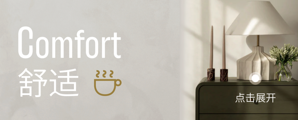
C=Comfort
Emotional Interpretation: Evokes feelings of “nourishment, tranquility, and healing.” These bright, relaxing colors are the precise choice for creating a sense of “happiness.”
Data Characteristics: Typically consist of colors with high lightness and low saturation.
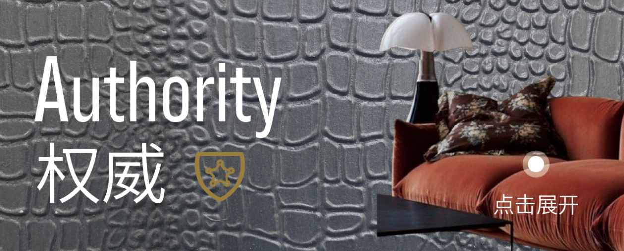
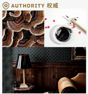
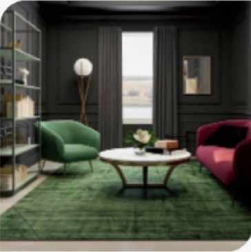
A=Authority
Emotional Interpretation: Projects an aura of “confidence, professionalism, and control.” These deep, steady colors are key to giving a space a sense of “security.”
Data Characteristics: Typically consist of colors with low lightness and low saturation.
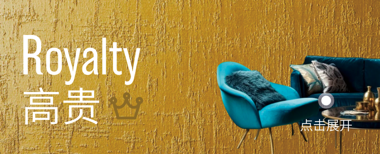
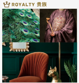
R=Royalty
Emotional Interpretation: Conveys “luxury, refinement, and timeless elegance.” They infuse a space with a distinct and noble, sophisticated texture.
Data Characteristics: Typically consist of colors with high saturation and low lightness.

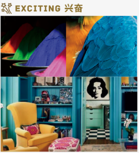
E=Excitement
Emotional Interpretation: Creates an “environment full of vitality, dynamism, and passion.” These vibrant, intense colors are designed to infuse a space with energy and personality.
Data Characteristics: Typically consist of colors with high lightness and high saturation.
Translate Emotion with Data, Build Trust with Science.

The C.A.R.E. system transforms abstract emotional needs into precise, actionable data for designers. These four emotional dimensions do not exist in isolation. By skillfully balancing the proportions of C.A.R.E. elements, designers can freely create and control a variety of decorative styles.
Decorative Styles
Nordic Style
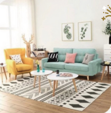
Main Color: C (Comfort)
Complementary Color: A (Authority)
Accent Color: E (Energy), R (Refinement)
Scandinavian style is renowned for its brightness. Natural light itself is a defining characteristic of this aesthetic. Scandinavian design emphasizes the diversity of light sources and variations in lighting ambiance. Spaces in this style typically feature large windows that allow ample natural light to flood in, requiring consistent and stable illumination throughout.
The color palette is predominantly neutral, featuring soft, subdued tones such as white, brown, light green, pale yellow, and muted shades of purple.
Rustic & Transitional Design Styles
Main Color: C (Comfort)
Complementary Color: A (Authenticity/Authority)
Accent Color: –
Rustic design emphasizes organic materials and natural elements. While many associate this interior style with the rugged look of log cabins or country cottages, rustic style is not limited to these. Rustic decor is an eclectic aesthetic that showcases the beauty of soft tones, natural materials (think wood beams or the texture of stone and clay), and comfortable furniture. This versatile design style can be applied to almost any interior space, such as bathrooms and living rooms.
Transitional style refers to the fusion of traditional and modern furniture. It is a combination of various design styles, creating a cohesive and integrated design within a single room. This style relies on the simplicity of neutral color palettes. Contrast and depth are achieved by mixing different shades within the same specific palette or through bold colors and patterns in furniture and accent pieces.
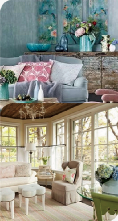
French Country and Shabby Chic styles
Main Color: C (Comfort)
Complementary Color: E (Energy)
Accent Color: R (Refinement)
French Country style draws inspiration from rural French homes, blending rustic and refined decor. This globally popular style is beloved for its comfort, casual elegance, and understated charm. It is characterized by three distinct features:
- Soft-patterned and gently colored fabrics
- Aged, painted, and vintage furniture and accessories
- Abundant use of wood and other natural materials
Shabby Chic, sometimes referred to as “distressed chic,” has been a particularly popular interior design style in recent years. The term describes a modern, simplified approach to using and refurbishing old, new, or repurposed items. Shabby Chic is synonymous with femininity, and every room decorated in this style becomes a true feminine oasis. This style embraces a lived-in, romantic aesthetic, often featuring worn finishes, floral motifs, soft palettes, and a sense of curated nostalgia.
Eclecticism and Children’s Room
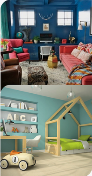
Main Color: E
Complementary Color: R
Accent Color: C
Eclectic-style decoration results from the careful blending of various colors with a neutral color in a space. For example, walls can be colorful while furniture follows a simple monochromatic layout. Choosing a series of core colors for your eclectic design is a great starting point and helps create a unified and harmonious look.
First, select a neutral hue and an accent color. Using a calming neutral tone throughout the room serves as a foundational layer, preventing the space from feeling overly exaggerated. This neutral, paired with your chosen accent color, works wonders—especially when applied to different aspects of the room—creating a harmonious space rather than a mismatched or chaotic one. Choosing a series of core colors to complement your eclectic design is an excellent starting point and can also serve as a guide to help you achieve a cohesive look.
Traditional Asian Style
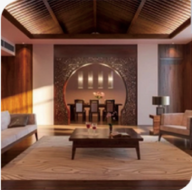
Main Color: A>C
Complementary Color: –
Accent Color: R
Traditional Asian interior design emphasizes harmony, balance, tranquility, and a simplicity that feels like home. It draws inspiration from Asian cultures, often reflecting the importance of integrating nature into decor. The result is a distinctive interior style that is simple, earthy, and rich in layers. Soft tones such as white, light brown, ivory, and beige are commonly used. The colors employed in traditional design are typically warm, earthy, and comforting.
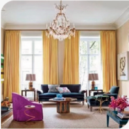
Hollywood Style and Paris Style
Main Color: 0
Complementary Color: R
Accent Color: R, E
When lines and patterns differ,
Main Color: 0
Complementary Color: R, E
Accent Color: Minimal A
For Hollywood style, combining subtle shades such as white, cream, light pink, and gray with gold or silver can create an elegant and balanced look. To achieve a more dramatic effect, jewel tones like red, green, blue, or purple can be chosen, paired with polished gold accents.
“Hollywood Regency style, also known as Modern Regency, focuses on showcasing luxurious yet highly livable spaces, using bold contrasting colors and designs featuring metallic and glass elements.” — Brian Stoddard, Homewares Insider
A balance should be maintained between the palette, decor, and layout. The design should be bold but not overly exaggerated. You can also choose to blend elements from other cultures, eras, and design styles. For color schemes:
“Black and white are classic, especially when paired with pink or teal, reminiscent of Dorothy Draper’s style. Keep colors clean to maintain a fresh and charming look without overwhelming the room.” — Martha McNamara, Vevano Home
Black and white are a commonly used color combination as they evoke a classic Hollywood atmosphere and create a beautiful contrast. Bright and vivid accent colors, such as red, pink, green, or yellow, can be added to energize this aesthetic. Overall, choose bold colors but limit them to three to avoid appearing too jarring. Brass is the most common metallic finish in this aesthetic, but chrome also works well.
The Parisian design palette consists of various shades of white, soft hues, and earthy tones such as light beige, gray, and olive green. Examples include stone walls, beige textiles like light cotton or linen fabrics that provide warmth, and natural materials such as sheepskin or wool rugs, which contribute to a calm Parisian decor. Additionally, black, beige, subtle gray, and blue-gray are skillfully used on interior doors and feature walls.
Vibrant yellow, pale pink, lush green, various shades of blue and purple, and ruby red are also integral parts of Parisian design style apartments. Furthermore, these colors sometimes appear on accent walls, sofas, chairs, cushions, or other French home decor accessories.
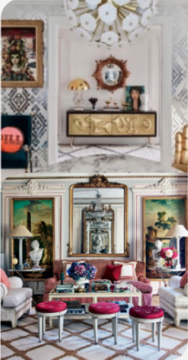
Milanese Style
Primary Color: A, R
Complementary Color: –
Accent Color: C
The Milanese interior style carries a strong, definitive tone, blending dark woods with stone, gray, and black fabrics. Jewel-toned accents are introduced through soft furnishings and decor. The infusion of yellow, graphically inspired cushions, and hand-painted walls truly encapsulate the color palette of Milanese design.
Splashes of yellow, charcoal, and navy blue evoke a retro feel.
Rich dark woods paired with golden tones create a perfect match for designers.
Matte black lighting fixtures introduce a sleek element, blending classic and modern designs, while eclectic brass stools add texture and color to a white palette.
A palette of black, gold, silver/chrome, and white defines the luxurious and opulent Art Deco style. However, bold yet comfortable colors complement these elegant shades perfectly, enhancing contrast within the space. Creating an Art Deco-inspired ambiance indoors requires boldness and luxury. This style is elegant, functional, and modern—while it dates back to the 1920s, it still harmonizes seamlessly with contemporary homes. Many colors complement these high-shine metallic or black decorative details: vibrant deep yellows, reds, greens, blues, and pinks are most commonly used in traditional Art Deco interiors. For a more serene or subdued interior, softer shades such as creams and beiges are ideal, as they pair well with silver or chrome-plated accents. These also beautifully complement polished wood and lacquered finishes, which are typical features of the Art Deco era.
Contemporary Style
Main Color: Equal proportions of C, A, R, E
Neutrals, black, and white are foundational colors in contemporary interior style. The palette often incorporates bright, bold accents to highlight neutral tones. Contemporary decor is classic and timeless—calm and serene, with an emphasis on architectural elements, decorative details, striking proportions, and a restrained color scheme, creating warmth through simplicity and sophistication. Clean lines, textural interplay, and subtle drama are essential to achieving a perfectly balanced contemporary home.
When a client next presents an abstract emotional need, you can confidently turn to the data without guesswork, making precise color choices based on their corresponding data profiles.
This is the power of building trust with data and realizing creativity through science.
Why Choose iLuvVivid Artisan Paint?
We know you’re not just looking for paint—you want a partner to help elevate your space. iLuvVivid’s artistic coatings deliver stunning color with premium performance, making it easy to achieve your vision in one step.
Website: www.iLuvVivid.com
About Us